Advanced Usage
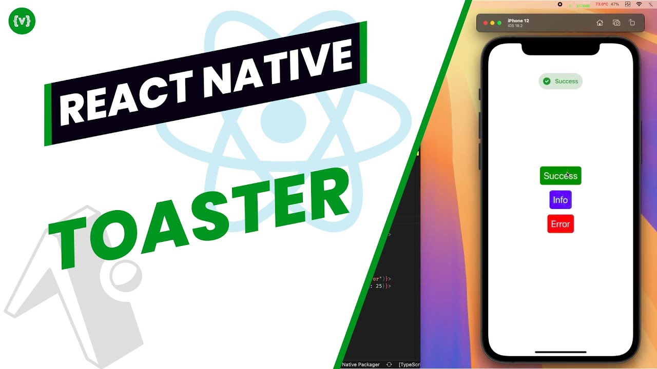
Toast Types
The library supports three types of toasts that can be used to convey different types of messages: info (default), success, and error.
Avoid showing multiple toasts simultaneously as it may lead to poor user experience. The library handles this automatically with a smart queueing system.
// Show an info toast (default)
showToast('This is an info message');

// Show a success toast
showToast('Operation successful!', 'success');

// Show an error toast
showToast('Something went wrong', 'error');
Custom Configuration
You can customize the duration and animation speed of toasts to match your app's requirements. Longer durations are suitable for important messages.
Avoid setting extremely short durations as users might miss important information. Also, very long durations might annoy users.
// Custom duration (8 seconds)
showToast('This will stay longer', 'info', { duration: 8000 });

// Custom animation speed (200ms)
showToast('Quick animation', 'success', { animationDuration: 200 });

// ✨ NEW FEATURE! Custom position from top (120px)
showToast('Custom position', 'info', { position: 120 }); // Customize the distance from top!
Customizing the Toaster Component
Customize the default behavior and appearance of the Toaster component by providing custom icons and colors for different toast types.
Ensure that custom colors maintain sufficient contrast for text readability and that custom icons are appropriately sized.
import React from 'react';
import { View } from 'react-native';
import { Toaster } from '@masumdev/rn-toast';

export default function App() {
  return (
    <View style={{ flex: 1 }}>
      <Toaster
        defaultDuration={3000} // 3 seconds default duration
        defaultAnimationDuration={300} // 300ms animation
        customIcons={{
          success: require('./assets/my-success-icon.png'),
          error: require('./assets/my-error-icon.png'),
          info: require('./assets/my-info-icon.png')
        }}
        customColors={{
          success: { background: '#e6ffe6', text: '#006600' },
          error: { background: '#ffe6e6', text: '#cc0000' },
          info: { background: '#e6f2ff', text: '#0066cc' }
        }}
      />
      {/* Your app content */}
    </View>
  );
}
Manual Toast Control
Use the hideToast function for scenarios where you need programmatic control over toast dismissal, such as when completing an async operation.
Be cautious when manually hiding toasts as it might interrupt important messages. Always consider the user experience.
import React from 'react';
import { Button, View } from 'react-native';
import { useToast } from '@masumdev/rn-toast';

export default function MyComponent() {
  const { showToast, hideToast } = useToast();

  const showMessage = () => {
    showToast('Custom position', 'info', { position: 120 });
  };

  const hideMessage = () => {
    hideToast(() => {
      console.log('Toast was dismissed');
    });
  };

  return (
    <View>
      <Button title="Show Toast" onPress={showMessage} />
      <Button title="Hide Toast" onPress={hideMessage} />
    </View>
  );
}