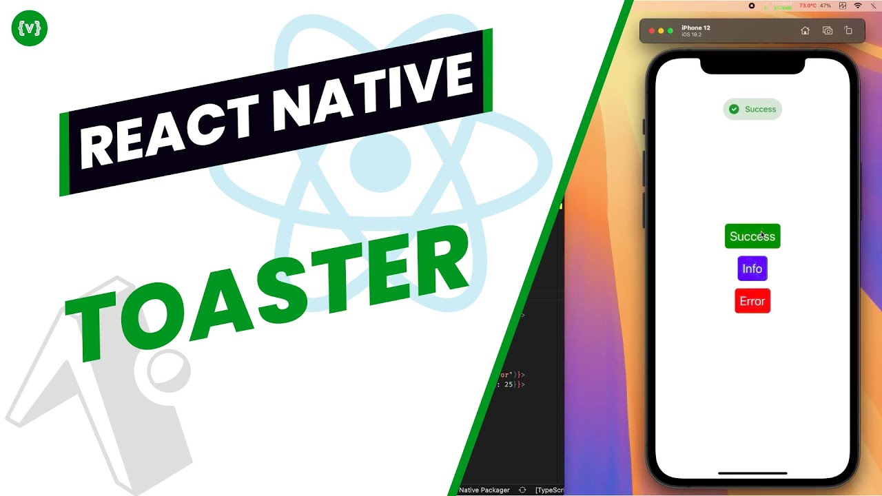
Demo
Demo of the Toast component on Android and iOS devices.


Overview
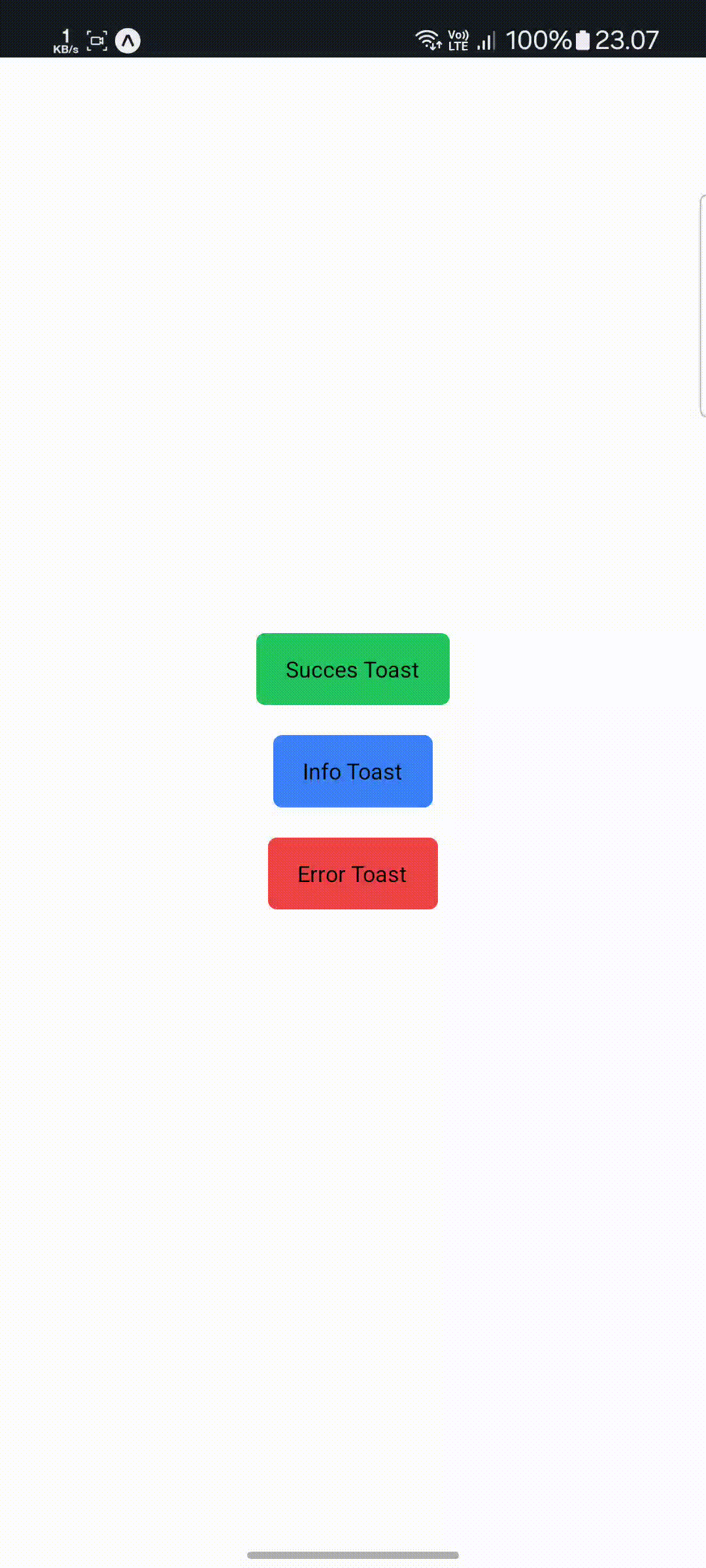
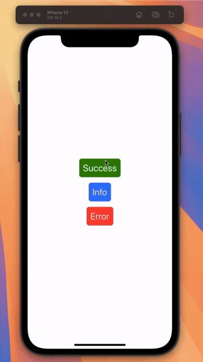
Experience our Toast component in action across both Android and iOS platforms. The demonstrations below showcase the smooth animations, customizable styles, and responsive behavior of the component.
Android Demo
iOS Demo
Features
- 🎨 Customizable styles and animations
- 📱 iOS and Android native feel
- 💫 Smooth animations using react-native-reanimated
- 🔄 Queue management for multiple toasts
- ⏱️ Configurable duration and auto-dismiss
- 🎯 Custom content support
- 🛡️ Safe area support
Performance Optimization
For optimal performance, consider these best practices:
- Memoize custom toast content components
- Keep toast messages concise
- Use appropriate animation durations
- Implement proper cleanup for toast subscriptions
Common Pitfalls
Be cautious of these common issues:
- Avoid showing too many toasts simultaneously
- Don't trigger toasts during animations
- Ensure proper z-index handling
- Test thoroughly on both platforms
Key Interactions Demonstrated
Toast Types
- Success notifications with checkmark icon
- Error messages with warning symbol
- Info toasts with custom icons
- Loading states with spinners
Animation Features
- Smooth fade in/out transitions
- Slide animations from top/bottom
Customization Options
- Custom styling and themes
- Dynamic content rendering
- Flexible positioning
- Duration control
Toast Best Practices
To provide the best user experience:
- Keep messages short and clear
- Use appropriate toast duration
- Position toasts consistently
- Add proper spacing between multiple toasts
Memory Management
Watch out for these issues:
- Clear toast queues on component unmount
- Handle memory leaks from animations
- Manage toast lifecycle properly
- Clean up custom content references
Try It Yourself
To get started with this component in your own project, check out our installation guide and basic usage examples.